The Assignment
Through the Diabetes Empowerment Education Program (DEEP), University of Illinois at Chicago's Midwest Latino Health Research, Training and Policy Center trains community health workers to help diabetics self-manage their illness. The program entails in-person training sessions as well as access to an education curriculum with matching PowerPoint slides. The program is available in 38 states and offers helpful information for people who face linguistic, economic and/or geographic barriers to quality healthcare. Prior to my involvement, DEEP existed as a 1,000 page word document. I was hired to transform it into a cohesive, easy-to-navigate design with matching PowerPoint slides.
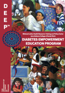
Approach
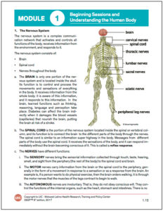
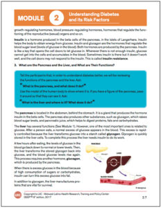
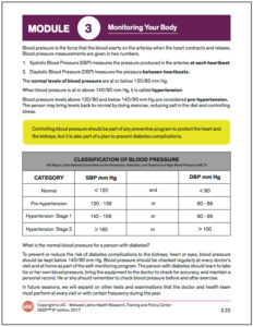
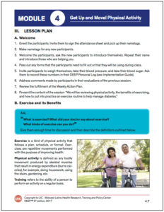
The Midwest Latino Health Research, Training and Policy Center provided three directives for the design: follow UIC’s brand guidelines, use imagery reflective of the target demographic and create a consistent format to improve readability. To address these requirements I used UIC’s branded font and colors throughout the text, sourced stock photos that reflect the Hispanic and African American communities the program serves and used color-coding, numbering and paragraph styling to organize the text. I decided InDesign was the best program to use for a project of this size (the final design, excluding PowerPoint slides, was 359 pages). I used master pages to easily replicate cover pages, headers and footers and automatic page numbering. I used color swatches and paragraph styles to easily reproduce section and text formatting.
Section Covers
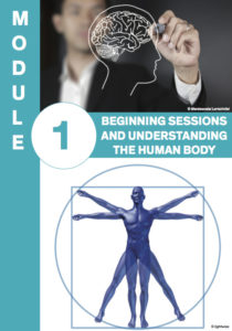
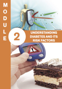
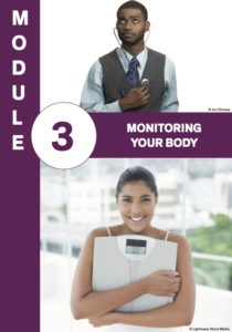
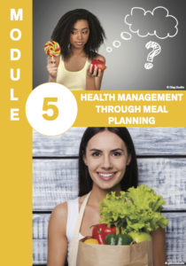
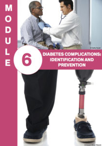
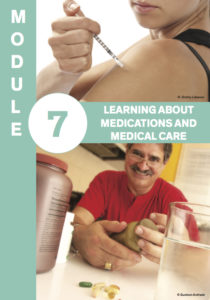
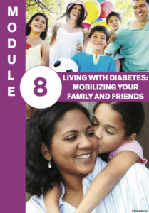
I assigned a different UIC brand or sub-brand color to each section of the text. Then I created a cover page for each section that utilized its identifying color, number and name.

Headers, Footers, Paragraph Styles and Callout Boxes
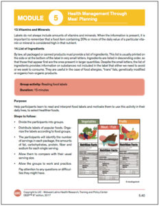
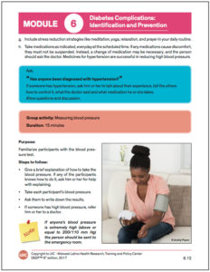
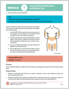
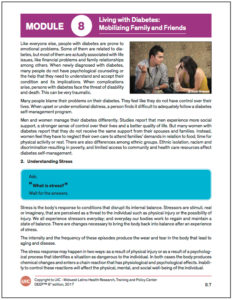
Headers, specific to each section, were used to help readers navigate the text. These headers contained the section's color, number and name. Footers included copyright information as well as a page number. Each section had its own page numbering format, beginning with the section number and followed by dot current page number. I created a five-tier paragraph style system to help readers distinguish how different parts of the text related to each other. I also created a bullet system to help readers distinguish activities from the rest of the text. Three types of callout boxes were used to help draw attention to special parts of the text. Yellow boxes were used to highlight very important information. Blue boxes were used to signify questions health promoters should ask participants. Pink boxes were used to identify activities that promoters and participants should do together.
Appendices, Forms and Handouts
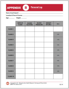
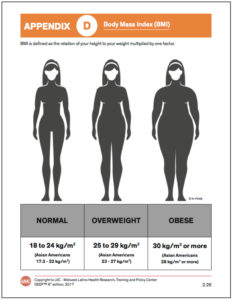
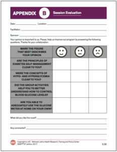
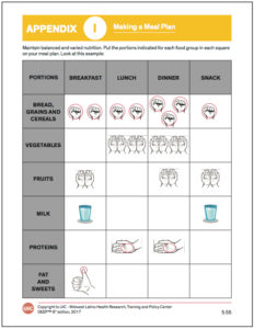
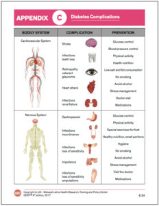
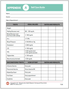
Each section included its own appendix. These appendices contained handouts detailing important information that participants could keep in accessible areas of their homes. They also contained forms that could be used to track medical history, health status and class progress. The appendices’ header colors, footers and page numbers matched those of their section, however, each had its own identifying letter and name included in the header. This made appendices, which had been referred to in the text, easy to search.
PowerPoint Slides
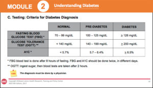
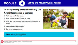
PowerPoint slides were used to provide visual aids during DEEP training sessions. I used the same color scheme, paragraph styles, callout boxes, headers and footers for the slides as I did the curriculum. This made following along as easy as possible for the participants.

Testimonial
We had the pleasure of working with Katherine Rasmussen Polovina from Luna Light Media. We requested Katherine's expertise in graphic design for the 2017 version of our Diabetes Empowerment Education Program (DEEP). Katherine showed patience and compliance in addressing all the administrative demands placed by the University, and demonstrated her professionalism and grace at every step. It is very easy to work with her. Katherine is kind, listens to her client's concerns, and is flexible in accommodating those demands. The final product not only captures her knowledge and artistic skills, but reflects the beauty and joy of the communities that inspire our work. We highly recommend Katherine for your graphic design and photography projects.


 Previous Post